How to Add a Floating Menu to a Carrd Website
How to add a floating hamburger menu to a Carrd website with custom HTML/CSS/JS. Includes accessibility fixes, troubleshooting, and styling tips.
 Dragos28 min read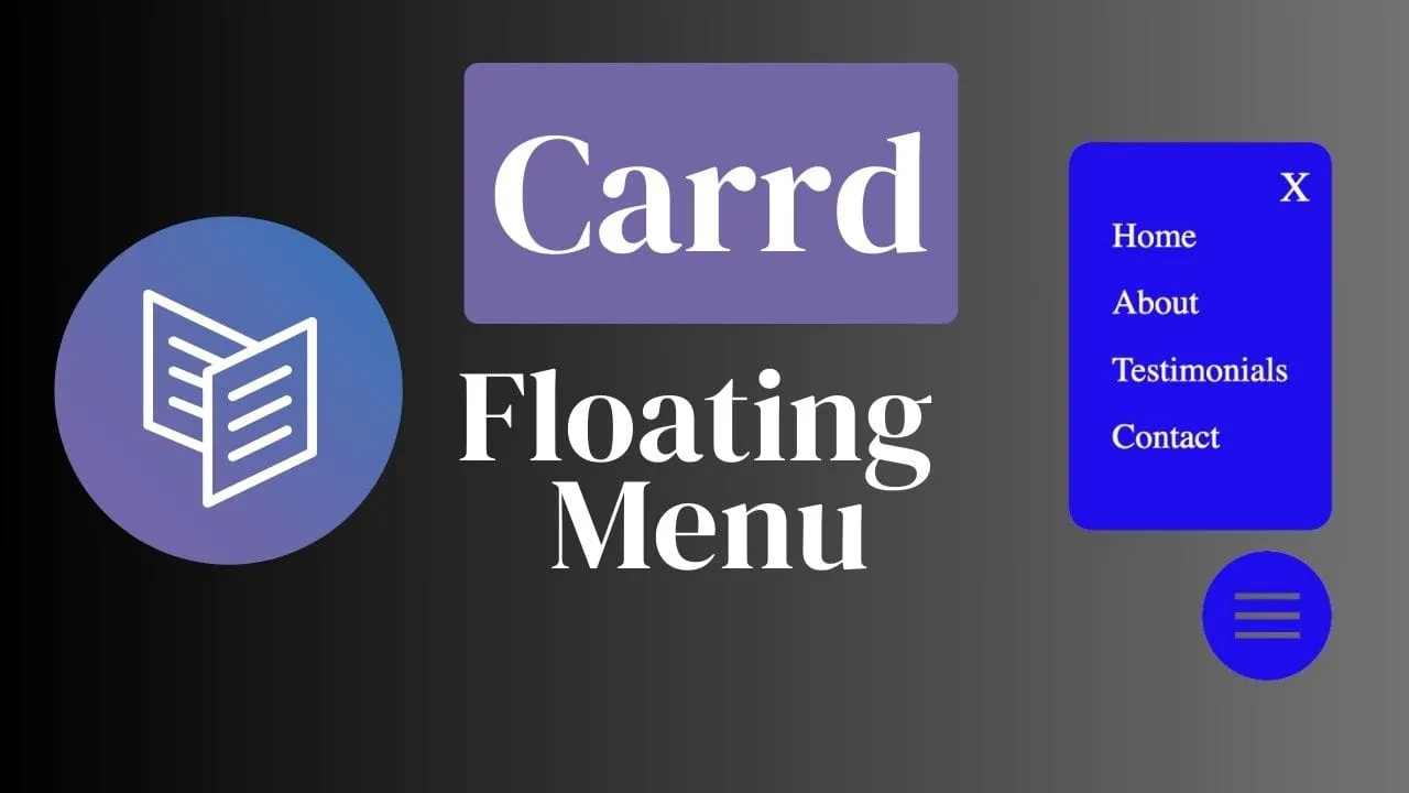
Carrd.co is a solid platform for one-page websites, but when your page has many sections, visitors lose their place fast. A floating hamburger menu fixes that. It gives your Carrd site always-visible navigation that sits in the bottom-right corner, right where a thumb naturally rests on mobile.
Carrd’s native elements don’t include a floating nav component, so you need custom code via the Embed element. The good news: one embed block, one paste, and you’re done. The code below includes built-in accessibility (ARIA attributes, keyboard support, reduced-motion handling) and won’t break your existing Carrd styling.
If you’re evaluating the platform, check our Carrd.co review first.
Try Carrd.coWhy a floating hamburger menu improves your Carrd site
- Navigation stays accessible without cluttering the main content area, especially on mobile screens
- The hamburger icon is universally recognized. Users know to tap it for a menu
- Bottom-right placement matches the natural thumb position for one-handed mobile use
- With
position: fixed, the menu stays visible as visitors scroll through your entire page
Prerequisites
Before you start, make sure you have:
- A Carrd Pro Standard ($19/yr) or Pro Plus ($49/yr) plan. Custom code Embeds are NOT available on the Free plan or Pro Lite ($9/yr). This is the number one reason the floating menu “doesn’t work” for people. Their plan doesn’t support Embeds. See Carrd’s plan comparison for details.
- A Carrd site with sections you want to link to. Each menu item points to an anchor ID (like
#about,#contact). If you haven’t set up section IDs yet, do that first. - The ability to publish your site. Custom code Embeds do NOT preview in the Carrd builder. You must publish to see the floating menu in action.
Pro plan required
The Embed element requires Carrd Pro Standard ($19/yr) or higher. Free and Pro Lite ($9/yr) plans cannot use custom code embeds. If you’re on Pro Lite, you’ll need to upgrade before this works.
If you’ve already added a back to top button on Carrd, you’ve used the same Embed workflow. For smooth scrolling between sections, see our guide on smooth scroll and anchor links in Carrd. Once your menu is working, consider adding a custom domain to Carrd for a professional URL.
How to add the Carrd floating hamburger menu
Three steps: add an embed, paste the code, customize your links.
1. Add an Embed element to your Carrd site
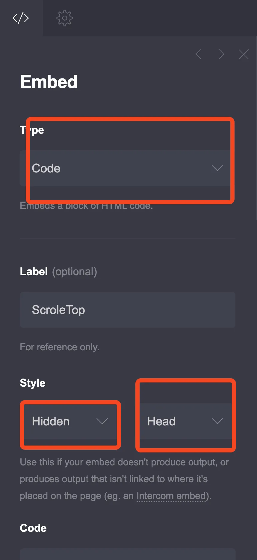
In the Carrd editor, click the + button and add an Embed element anywhere on the page. Configure it as:
- Type: Code
- Style: Hidden, Head
“Hidden, Head” means the code gets injected into the site’s <head>. It won’t show up as a visible content block on your page. The embed is invisible in the builder preview. You’ll only see the menu after publishing.
2. Add the HTML, CSS, and JavaScript code
Paste this complete code into the Embed element:
<style>
:root {
--primary-color-ha: rgba(0, 112, 15, 0.58);
--secondary-color-ha: #fff;
--font-size-base-ha: 16px;
--floating-hamburger-size: 50px;
--floating-font: inherit;
}
/* Scoped box-sizing: won't break Carrd's native styling */
.floating-hamburger,
.floating-hamburger *,
.floating-menu,
.floating-menu * {
box-sizing: border-box;
}
.floating-hamburger {
position: fixed;
bottom: 20px;
right: 20px;
width: var(--floating-hamburger-size);
height: var(--floating-hamburger-size);
background-color: var(--primary-color-ha);
border-radius: 50%;
display: flex;
flex-direction: column;
justify-content: center;
align-items: center;
cursor: pointer;
z-index: 1000;
}
.floating-hamburger:focus-visible {
outline: 2px solid var(--secondary-color-ha);
outline-offset: 2px;
}
.floating-hamburger .floating-bar {
width: 30px;
height: 3px;
background-color: var(--secondary-color-ha);
margin: 3px 0;
}
@media (prefers-reduced-motion: no-preference) {
.floating-hamburger .floating-bar {
transition: 0.4s;
}
}
#floating-menu-toggle {
display: none;
}
.floating-menu {
position: fixed;
bottom: calc(var(--floating-hamburger-size) + 30px);
right: 20px;
background-color: var(--primary-color-ha);
padding: 20px;
border-radius: 10px;
transform: scale(0);
transform-origin: bottom right;
z-index: 999;
font-family: var(--floating-font);
font-size: var(--font-size-base-ha);
}
@media (prefers-reduced-motion: no-preference) {
.floating-menu {
transition: transform 0.3s ease-in-out;
}
}
#floating-menu-toggle:checked ~ .floating-menu {
transform: scale(1);
}
.floating-menu ul {
list-style: none;
margin: 0;
padding: 0;
}
.floating-menu li {
margin: 15px 0;
}
.floating-menu li a {
color: var(--secondary-color-ha);
text-decoration: none;
font-size: 1em;
}
@media (prefers-reduced-motion: no-preference) {
.floating-menu li a {
transition: font-size 0.3s ease;
}
}
.floating-menu li a:hover {
font-size: 1.1em;
}
.floating-menu a:focus-visible {
outline: 2px solid var(--secondary-color-ha);
outline-offset: 2px;
}
.floating-close-button {
position: absolute;
top: 10px;
right: 10px;
background: none;
border: none;
color: var(--secondary-color-ha);
font-size: 1.2em;
cursor: pointer;
font-family: var(--floating-font);
}
</style>
<input type="checkbox" id="floating-menu-toggle" />
<label for="floating-menu-toggle" class="floating-hamburger"
aria-label="Open navigation menu" tabindex="0" role="button">
<span class="floating-bar"></span>
<span class="floating-bar"></span>
<span class="floating-bar"></span>
</label>
<nav class="floating-menu" role="navigation">
<button class="floating-close-button" aria-label="Close menu">✕</button>
<ul>
  <li><a href="#">Home</a></li>
  <li><a href="#about">About</a></li>
  <li><a href="#testimonials">Testimonials</a></li>
  <li><a href="#contact">Contact</a></li>
</ul>
</nav>
<script>
const toggle = document.getElementById("floating-menu-toggle");
const label = document.querySelector(".floating-hamburger");
// Toggle aria-expanded for screen readers
toggle.addEventListener("change", function () {
label.setAttribute("aria-expanded", this.checked);
});
label.setAttribute("aria-expanded", "false");
// Close button
document.querySelector(".floating-close-button").addEventListener("click", function () {
toggle.checked = false;
label.setAttribute("aria-expanded", "false");
label.focus();
});
// Close on link click
document.querySelectorAll(".floating-menu a").forEach(function (link) {
link.addEventListener("click", function () {
toggle.checked = false;
label.setAttribute("aria-expanded", "false");
});
});
// Escape key closes menu, returns focus to hamburger
document.addEventListener("keydown", function (e) {
if (e.key === "Escape" && toggle.checked) {
toggle.checked = false;
label.setAttribute("aria-expanded", "false");
label.focus();
}
});
</script>What changed from the old code
Two critical fixes for returning readers: (1) The global * { margin: 0; padding: 0; box-sizing: border-box; } reset has been removed. It was destroying Carrd’s native element spacing. (2) The body { font-size; font-family } override has been removed. It was hijacking all text on the page. Both are replaced with scoped selectors that only affect the floating menu itself.
Accessibility built in
This code includes ARIA attributes (aria-label, aria-expanded, role="navigation"), visible focus outlines for keyboard users, @media (prefers-reduced-motion: no-preference) wrapping all animations, and Escape key support to close the menu. This addresses the European Accessibility Act (effective June 28, 2025) requirements for interactive UI elements.
CSS custom properties explained
These variables at the top of the <style> block control the menu’s appearance. Change them to match your site’s design:
-
--primary-color-ha: Background color of the hamburger button and menu panel. Usesrgba()for transparency so visitors can still see content behind the menu. Change the RGB values and alpha to match your brand. Use https://rgbacolorpicker.com/ to pick a color. -
--secondary-color-ha: Color of the hamburger bars, menu text, and close button. Default is white (#fff). -
--font-size-base-ha: Base font size for menu items. Default16pxis a good baseline for readability. -
--floating-hamburger-size: Diameter of the circular hamburger button in pixels. Default50pxis comfortable to tap on mobile. -
--floating-font: Font family for menu text. Defaultinherituses your Carrd site’s font. Replace with a specific font stack if you want a different look (e.g.,"Inter", sans-serif). -
.floating-hamburger .floating-barwidth: 30px: Controls the width of the three hamburger lines. Adjust if you want narrower or wider bars inside the button.
3. Customize the menu items and links
The menu items are in the <ul> inside the <nav>:
<ul>
<li><a href="#">Home</a></li>
<li><a href="#about">About</a></li>
<li><a href="#testimonials">Testimonials</a></li>
<li><a href="#contact">Contact</a></li>
</ul>Add, remove, or rename items to match your Carrd site’s sections. Each href should point to the section’s anchor ID in your Carrd editor (e.g., #about links to the section with ID about). Using href="#" scrolls back to the top of the page.
For the best experience, pair this menu with smooth scroll and anchor links in Carrd so clicking a menu item scrolls smoothly instead of jumping.
Verify your floating menu works
After publishing your Carrd site, run through this checklist:
- Publish the site. Embeds don’t work in the builder preview. This is the most common “it doesn’t work” mistake.
- Open the published URL in an incognito/private window. Clears any cached state.
- Click the hamburger button. The menu should scale in from the bottom-right corner.
- Click a menu link. The page scrolls to that section and the menu closes automatically.
- Click the close (✕) button. The menu closes and focus returns to the hamburger button.
- Test on a real mobile device (or Chrome DevTools device emulator). The button should be easy to tap with a thumb.
- Keyboard test. Tab to the hamburger button, press Enter/Space to open, Tab through menu items, press Escape to close. Focus should return to the hamburger.
- Check for overlaps. The menu shouldn’t cover other fixed elements like cookie notices or back-to-top buttons. If you have a WhatsApp button on Carrd or similar floating elements, adjust
z-indexvalues to prevent stacking conflicts. - Reduced motion test. Enable your OS “Reduce motion” setting and verify the menu opens/closes instantly without animation.
Embeds don't preview in the builder
You MUST publish your Carrd site to see the floating menu. The Carrd builder does not render custom code embeds in its preview. If you can’t see the menu, publish first, then check the live site.
Troubleshooting common issues
Menu doesn't appear at all
Three things to check in order:
- Your plan. Embeds require Carrd Pro Standard ($19/yr) or Pro Plus ($49/yr). Free and Pro Lite ($9/yr) plans don’t support custom code. Check your plan at carrd.co/docs/pro/plans.
- Embed settings. The embed must be set to Type: Code, Style: Hidden, Head. If Style is set to something else, the code won’t inject into
<head>. - You’re looking at the builder, not the published site. Publish first, then open the live URL.
Menu breaks other elements on the page
If you’re using older code that includes * { margin: 0; padding: 0; box-sizing: border-box; }, that global reset is the problem. It wipes out Carrd’s native spacing on every element. Replace it with the scoped version in the code above. It only applies box-sizing to the floating menu’s own elements.
Menu appears behind other elements
Increase the z-index on .floating-hamburger (currently 1000) and .floating-menu (currently 999). The element with the higher z-index value appears on top. If you have other custom elements with high z-index values, you may need to go higher. If you’re using CSS custom properties for other Carrd customizations like a dark mode toggle, make sure your variable names don’t conflict.
Hamburger doesn't respond to click
Another fixed-position element is likely overlapping the hamburger button. Right-click the hamburger area, choose “Inspect,” and look at the z-index of nearby elements. A cookie banner or chat widget with a higher z-index will block clicks. Adjust z-index values so the hamburger sits on top.
JavaScript doesn't work
Open your browser console (F12) and check for errors. If you have multiple Carrd embeds with <script> blocks, they can conflict, especially if they use the same variable names. Make sure each embed uses unique IDs and variable names. The checkbox hack used here is the same pattern as a popup modal on Carrd. If you have both, ensure each uses a unique checkbox ID.
Code won't save in the embed
Carrd embeds have a 16,384 character limit. The code in this article is well under that, but if you’ve added a lot of custom CSS or extra menu items, you might hit it. Split the code into two embeds: put the <style> block in a “Hidden, Head” embed and the HTML + <script> in a “Hidden, Body End” embed.
Menu works on desktop but not mobile
Carrd has responsive visibility settings per element. Check that your Embed element isn’t hidden on mobile breakpoints. In the Carrd editor, select the embed and look for visibility toggles. Make sure it’s visible on all device sizes.
Alternative navigation approaches for Carrd
The floating hamburger menu is one way to handle Carrd navigation. Here are other patterns depending on your needs:
- Sticky header. A fixed header bar with navigation links that stays at the top of the viewport. Different visual pattern from a floating button. See our sticky header in Carrd tutorial.
- Sidebar menu. A slide-in panel from the edge of the screen, good for sites with many navigation items. Our sidebar menu for Carrd guide covers this.
- Mobile responsive navbar. A hamburger menu that integrates into the page header rather than floating. See Carrd mobile responsive navbar for three different methods.
- Third-party plugins. Pre-built Carrd widgets that handle navigation for you. Options include the Tabs plugin and Accordion plugin from CarrdMe, or browse Plugin Kitchen and Jason’s Plugins for more.
What about the native Popover API?
The HTML popover attribute (Baseline 2025, supported in all modern browsers) provides light-dismiss behavior, top-layer rendering, and keyboard handling natively with no JavaScript. In theory, it could simplify the floating menu significantly. In practice, Carrd’s embed constraints may strip or interfere with popover attributes. I haven’t tested it inside a Carrd embed yet. If you try it and it works, that would be a cleaner approach than the checkbox hack used here.
Conclusion
A floating hamburger menu gives your Carrd one-page site always-accessible, mobile-first navigation without cluttering the content area. The updated code is scoped (no global CSS resets that break Carrd’s styling), accessible (ARIA attributes, keyboard support, reduced-motion handling), and customizable through CSS custom properties.
Test on real devices after publishing, tweak the colors and sizing to match your brand, and you’ll have a navigation component that works for every visitor.