How to Add a Sidebar Menu to Your Carrd Website (2026)
Learn how to add a sidebar menu to your Carrd website with HTML, CSS & JS. Covers Pro Standard setup, section anchors, accessibility, and mobile optimization.

Updated Published 47 min read
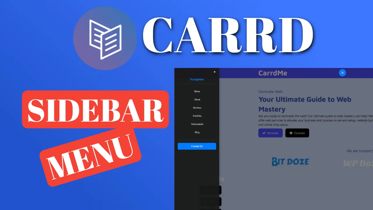
Carrd.co is an excellent platform for creating one-page websites, but navigation gets tricky once you have more than a few sections. A sidebar menu solves this by tucking navigation off-screen until the visitor needs it. No wasted screen space, no cluttered header.
A carrd sidebar menu works well because:
- It maximizes content space. Navigation stays hidden until the visitor taps the hamburger button, keeping the focus on your content.
- Better organization for sites with multiple sections. Visitors can jump to any area without scrolling.
- Mobile-friendly. The slide-in panel uses touch-friendly targets (40px+) and handles iOS scroll-lock properly.
- Customizable positioning. Open from the left or right, float the button or pin it to a spot on the page.
Some Carrd tutorials:
- Add a floating menu to Carrd
- Add a sticky header to Carrd
- Add a cookie notice to Carrd
- Add a pricing table to Carrd
- Carrd.co review
- Add accordion FAQs to Carrd
- Carrd mobile responsive navbar
- Carrd back to top button (2026 guide)
- Popup modal for Carrd
- Carrd dark mode toggle
The complete list of Carrd plugins, themes, and tutorials is on my carrdme.com website.
Prerequisites: Carrd Pro Standard and the Embed element
Requires Carrd Pro Standard ($19/yr)
The Embed element is only available on Carrd Pro Standard ($19/yr) or Pro Plus ($49/yr) plans. The free Basic plan caps sites at 50 elements and has no Embeds. Pro Lite ($9/yr) does not include Embeds either.
There is a 7-day free Pro trial with no credit card required. The trial gives you Pro Plus features, which includes Embeds, so you can test the sidebar before committing.
If you’re upgrading, you’ll also want to add a custom domain to Carrd while you’re at it.
A few things to know before you start:
- Cost: $19/yr minimum (Pro Standard). That’s the floor for this approach.
- Scope: the code runs site-wide from a Hidden embed at Body End. Keep a backup of the code block. If something breaks, the fix is one republish away.
- Embeds don’t render in the Carrd builder. You must publish the site to see the sidebar. After publishing, hard-refresh (Ctrl+Shift+R) to bypass browser cache.
How to add the Carrd sidebar menu
The approach is straightforward: paste one HTML/CSS/JS block into an Embed element. No external dependencies, no API keys, no build step.
Publish to test
Embed elements are invisible in the Carrd builder preview. After adding the code, publish your site and open the live URL. Use Ctrl+Shift+R (or Cmd+Shift+R on Mac) to hard-refresh and bypass cached styles.
1. Add an Embed element (Type: Code, Style: Hidden, Body End)
Click the + button in the Carrd builder, add an Embed element, and set:
- Type: Code
- Style: Hidden, Body End
This injects your code at the end of the page’s <body>, outside Carrd’s own layout, so it loads on every section without taking up space in your design. Avoid Head here: the snippet contains visible markup (the button and the panel), and <head> is not a valid place for it.
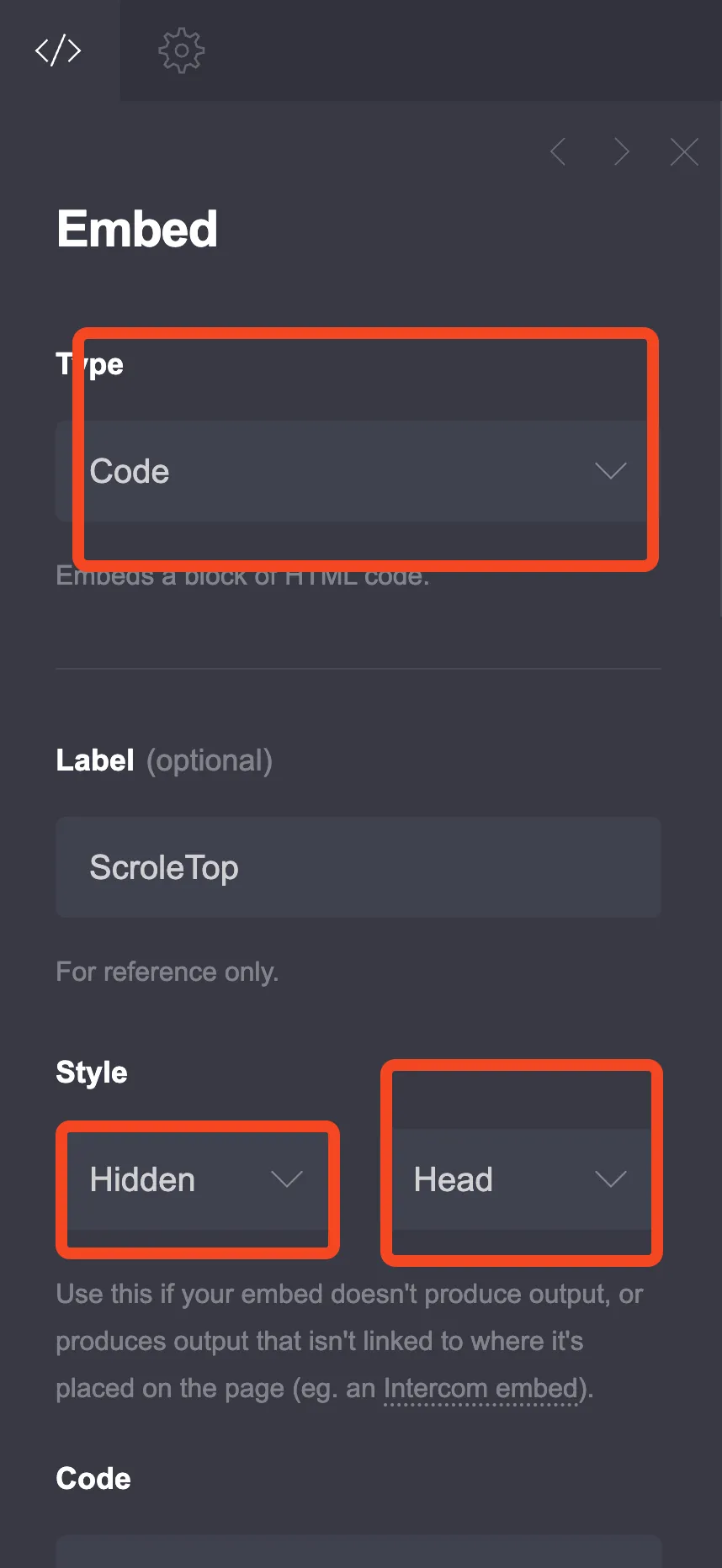
The screenshot shows the location dropdown set to Head; pick Body End instead.
2. Paste the HTML, CSS, and JavaScript code
Below is the complete code. Key improvements over a basic implementation: scoped box-sizing (no global reset), proper ARIA attributes for screen readers, focus management, and an iOS scroll-lock fix.
<style>
:root {
/* Sidebar Configuration */
--sidebar-position: left; /* Options: 'left' or 'right' */
--sidebar-width: 300px;
--sidebar-bg-color: rgba(25, 25, 25, 0.95);
--sidebar-text-color: #ffffff;
--sidebar-border-color: #444;
--sidebar-hover-color: rgba(255, 255, 255, 0.1);
--sidebar-accent-color: #007bff;
--contact-button-hover-color: #0056b3;
/* Menu Button Configuration */
--menu-button-bg: rgba(0, 123, 255, 0.9);
--menu-button-color: #ffffff;
--menu-button-size: 50px;
--menu-button-floating: true; /* Options: 'true' or 'false' (string, not boolean) */
--menu-button-float-position: top; /* Options: 'top' or 'bottom' (only when floating is true) */
--menu-button-float-side: left; /* Options: 'left' or 'right' (only when floating is true) */
--menu-button-position-top: 20px;
--menu-button-position-side: 20px;
/* Animation Settings */
--sidebar-animation-speed: 0.3s;
--button-animation-speed: 0.2s;
/* Typography */
--sidebar-font-family: inherit;
--sidebar-font-size: 16px;
--sidebar-heading-size: 20px;
/* Spacing */
--sidebar-padding: 20px;
--menu-item-spacing: 15px;
}
/* Scoped box-sizing reset (no global * selector) */
#sidebarToggle,
.sidebar-overlay,
#sidebarMenu,
#sidebarMenu * {
box-sizing: border-box;
}
/* Menu Toggle Button */
.sidebar-menu-toggle {
background-color: var(--menu-button-bg);
color: var(--menu-button-color);
border: none;
width: var(--menu-button-size);
height: var(--menu-button-size);
border-radius: 50%;
cursor: pointer;
z-index: 1001;
display: flex;
flex-direction: column;
justify-content: center;
align-items: center;
transition: all var(--button-animation-speed) ease;
box-shadow: 0 2px 10px rgba(0, 0, 0, 0.3);
}
/* Floating button positioning */
.sidebar-menu-toggle.floating {
position: fixed;
}
.sidebar-menu-toggle.floating.float-top {
top: var(--menu-button-position-top);
}
.sidebar-menu-toggle.floating.float-bottom {
bottom: var(--menu-button-position-top);
}
.sidebar-menu-toggle.floating.float-left {
left: var(--menu-button-position-side);
}
.sidebar-menu-toggle.floating.float-right {
right: var(--menu-button-position-side);
}
/* Static button positioning (when not floating) */
.sidebar-menu-toggle.static {
position: relative;
margin: 10px;
}
.sidebar-menu-toggle.static[data-position="left"] {
left: var(--menu-button-position-side);
}
.sidebar-menu-toggle.static[data-position="right"] {
right: var(--menu-button-position-side);
}
.sidebar-menu-toggle:hover {
transform: scale(1.1);
box-shadow: 0 4px 15px rgba(0, 0, 0, 0.4);
}
/* Hamburger Icon */
.hamburger-icon {
width: 20px;
height: 2px;
background-color: var(--menu-button-color);
margin: 2px 0;
transition: all var(--button-animation-speed) ease;
transform-origin: center;
}
/* Hamburger to X animation */
.sidebar-menu-toggle.active .hamburger-icon:nth-child(1) {
transform: translateY(6px) rotate(45deg);
}
.sidebar-menu-toggle.active .hamburger-icon:nth-child(2) {
opacity: 0;
transform: scaleX(0);
}
.sidebar-menu-toggle.active .hamburger-icon:nth-child(3) {
transform: translateY(-6px) rotate(-45deg);
}
/* Sidebar Overlay */
.sidebar-overlay {
position: fixed;
top: 0;
left: 0;
width: 100%;
height: 100%;
background-color: rgba(0, 0, 0, 0.5);
z-index: 999;
opacity: 0;
visibility: hidden;
transition: all var(--sidebar-animation-speed) ease;
}
.sidebar-overlay.active {
opacity: 1;
visibility: visible;
}
/* Sidebar Menu */
.sidebar-menu {
position: fixed;
top: 0;
width: var(--sidebar-width);
height: 100%;
background-color: var(--sidebar-bg-color);
color: var(--sidebar-text-color);
z-index: 1000;
padding: var(--sidebar-padding);
font-family: var(--sidebar-font-family);
font-size: var(--sidebar-font-size);
/* visibility keeps the closed panel's links out of the Tab order;
the delay lets the slide-out finish before it hides */
visibility: hidden;
transition: transform var(--sidebar-animation-speed) ease,
visibility 0s linear var(--sidebar-animation-speed);
overflow-y: auto;
box-shadow: 0 0 20px rgba(0, 0, 0, 0.3);
}
/* Sidebar positioning based on CSS variable */
.sidebar-menu[data-position="left"] {
left: 0;
transform: translateX(-100%);
border-right: 1px solid var(--sidebar-border-color);
}
.sidebar-menu[data-position="right"] {
right: 0;
transform: translateX(100%);
border-left: 1px solid var(--sidebar-border-color);
}
.sidebar-menu.active {
transform: translateX(0);
visibility: visible;
transition: transform var(--sidebar-animation-speed) ease;
}
/* Close Button */
.sidebar-close {
position: absolute;
top: 15px;
background: none;
border: none;
color: var(--sidebar-text-color);
font-size: 24px;
cursor: pointer;
width: 30px;
height: 30px;
display: flex;
align-items: center;
justify-content: center;
border-radius: 50%;
transition: background-color var(--button-animation-speed) ease;
}
.sidebar-close[data-position="left"] {
right: 15px;
}
.sidebar-close[data-position="right"] {
left: 15px;
}
.sidebar-close:hover {
background-color: var(--sidebar-hover-color);
}
/* Sidebar Header */
.sidebar-header {
margin-top: 50px;
margin-bottom: 30px;
padding-bottom: 20px;
border-bottom: 1px solid var(--sidebar-border-color);
}
.sidebar-title {
font-size: var(--sidebar-heading-size);
font-weight: bold;
margin: 0;
color: var(--sidebar-accent-color);
}
/* Navigation Menu */
.sidebar-nav {
list-style: none;
padding: 0;
margin: 0;
}
.sidebar-nav li {
margin-bottom: var(--menu-item-spacing);
}
.sidebar-nav a {
color: var(--sidebar-text-color);
text-decoration: none;
display: block;
padding: 12px 15px;
border-radius: 8px;
transition: all var(--button-animation-speed) ease;
border-left: 3px solid transparent;
}
.sidebar-nav a:hover {
background-color: var(--sidebar-hover-color);
border-left-color: var(--sidebar-accent-color);
transform: translateX(5px);
}
/* Contact Button */
.sidebar-contact-btn {
margin-top: 30px;
padding-top: 20px;
border-top: 1px solid var(--sidebar-border-color);
}
.contact-button {
display: block;
width: 100%;
padding: 15px;
background-color: var(--sidebar-accent-color);
color: white;
text-decoration: none;
text-align: center;
border-radius: 8px;
font-weight: bold;
transition: all var(--button-animation-speed) ease;
border: none;
cursor: pointer;
font-size: var(--sidebar-font-size);
}
.contact-button:hover {
background-color: var(--contact-button-hover-color);
transform: translateY(-2px);
box-shadow: 0 4px 10px rgba(0, 123, 255, 0.3);
}
/* Mobile Responsiveness */
@media (max-width: 768px) {
:root {
--sidebar-width: 280px;
--sidebar-font-size: 15px;
--sidebar-heading-size: 18px;
--menu-button-size: 45px;
}
}
@media (max-width: 480px) {
:root {
--sidebar-width: 250px;
--sidebar-font-size: 14px;
--sidebar-heading-size: 16px;
--menu-button-size: 40px;
--menu-button-position-top: 15px;
--menu-button-position-side: 15px;
}
}
/* Prevent body scroll when sidebar is open (includes iOS fix) */
body.sidebar-open {
overflow: hidden;
touch-action: none;
}
</style>
<!-- Menu Toggle Button (with accessibility attributes) -->
<button class="sidebar-menu-toggle" id="sidebarToggle"
aria-label="Open menu" aria-expanded="false" aria-controls="sidebarMenu">
<span class="hamburger-icon" aria-hidden="true"></span>
<span class="hamburger-icon" aria-hidden="true"></span>
<span class="hamburger-icon" aria-hidden="true"></span>
</button>
<!-- Sidebar Overlay -->
<div class="sidebar-overlay" id="sidebarOverlay"></div>
<!-- Sidebar Menu -->
<nav class="sidebar-menu" id="sidebarMenu" aria-hidden="true" tabindex="-1">
<button class="sidebar-close" id="sidebarClose" aria-label="Close menu">×</button>
<div class="sidebar-header">
<h3 class="sidebar-title">Navigation</h3>
</div>
<ul class="sidebar-nav">
  <li><a href="#home">Home</a></li>
  <li><a href="#about">About</a></li>
  <li><a href="#services">Services</a></li>
  <li><a href="#portfolio">Portfolio</a></li>
  <li><a href="#testimonials">Testimonials</a></li>
  <li><a href="#blog">Blog</a></li>
</ul>
<div class="sidebar-contact-btn">
<a href="#contact" class="contact-button">Contact Us</a>
</div>
</nav>
<script>
document.addEventListener('DOMContentLoaded', function() {
// Get elements
const toggleBtn = document.getElementById('sidebarToggle');
const closeBtn = document.getElementById('sidebarClose');
const overlay = document.getElementById('sidebarOverlay');
const sidebar = document.getElementById('sidebarMenu');
const body = document.body;
let savedScrollTop = 0;
// Get CSS variables
const sidebarPosition = getComputedStyle(document.documentElement)
.getPropertyValue('--sidebar-position').trim();
const isFloating = getComputedStyle(document.documentElement)
.getPropertyValue('--menu-button-floating').trim() === 'true';
const floatPosition = getComputedStyle(document.documentElement)
.getPropertyValue('--menu-button-float-position').trim();
const floatSide = getComputedStyle(document.documentElement)
.getPropertyValue('--menu-button-float-side').trim();
// Set button positioning classes
if (isFloating) {
toggleBtn.classList.add('floating');
if (floatPosition === 'bottom') {
toggleBtn.classList.add('float-bottom');
} else {
toggleBtn.classList.add('float-top');
}
if (floatSide === 'right') {
toggleBtn.classList.add('float-right');
} else {
toggleBtn.classList.add('float-left');
}
} else {
toggleBtn.classList.add('static');
}
// Set data attributes for positioning
toggleBtn.setAttribute('data-position', sidebarPosition);
closeBtn.setAttribute('data-position', sidebarPosition);
sidebar.setAttribute('data-position', sidebarPosition);
// Open sidebar function
function openSidebar() {
sidebar.classList.add('active');
overlay.classList.add('active');
toggleBtn.classList.add('active');
body.classList.add('sidebar-open');
// Accessibility: update ARIA states
toggleBtn.setAttribute('aria-expanded', 'true');
toggleBtn.setAttribute('aria-label', 'Close menu');
sidebar.removeAttribute('aria-hidden');
// iOS scroll-lock: use position: fixed to prevent background scroll
savedScrollTop = window.pageYOffset || document.documentElement.scrollTop;
body.style.position = 'fixed';
body.style.top = '-' + savedScrollTop + 'px';
body.style.width = '100%';
// Focus management: move focus into sidebar
sidebar.focus({ preventScroll: true });
}
// Close sidebar function
function closeSidebar() {
sidebar.classList.remove('active');
overlay.classList.remove('active');
toggleBtn.classList.remove('active');
body.classList.remove('sidebar-open');
// Accessibility: update ARIA states
toggleBtn.setAttribute('aria-expanded', 'false');
toggleBtn.setAttribute('aria-label', 'Open menu');
sidebar.setAttribute('aria-hidden', 'true');
// iOS scroll-lock: restore scroll position
body.style.position = '';
body.style.top = '';
body.style.width = '';
// Jump straight back even if the site uses smooth scrolling
const html = document.documentElement;
html.style.scrollBehavior = 'auto';
window.scrollTo(0, savedScrollTop);
html.style.scrollBehavior = '';
// Focus management: return focus to toggle button
toggleBtn.focus({ preventScroll: true });
}
// Tab-key focus trap inside sidebar when open
sidebar.addEventListener('keydown', function(e) {
if (e.key === 'Tab' && sidebar.classList.contains('active')) {
const focusable = sidebar.querySelectorAll(
'a[href], button, [tabindex]:not([tabindex="-1"])'
);
const first = focusable[0];
const last = focusable[focusable.length - 1];
if (e.shiftKey && (document.activeElement === first || document.activeElement === sidebar)) {
e.preventDefault();
last.focus();
} else if (!e.shiftKey && document.activeElement === last) {
e.preventDefault();
first.focus();
}
}
});
// Event listeners
toggleBtn.addEventListener('click', function(e) {
e.stopPropagation();
if (sidebar.classList.contains('active')) {
closeSidebar();
} else {
openSidebar();
}
});
closeBtn.addEventListener('click', closeSidebar);
overlay.addEventListener('click', closeSidebar);
// Close sidebar when clicking on navigation links
const navLinks = document.querySelectorAll('.sidebar-nav a, .contact-button');
navLinks.forEach(function(link) {
link.addEventListener('click', function() {
closeSidebar();
});
});
// Close sidebar on Escape key
document.addEventListener('keydown', function(e) {
if (e.key === 'Escape' && sidebar.classList.contains('active')) {
closeSidebar();
}
});
// Handle window resize
window.addEventListener('resize', function() {
if (window.innerWidth > 768 && sidebar.classList.contains('active')) {
closeSidebar();
}
});
});
</script>If your published site goes blank
A JavaScript syntax error will break the entire Carrd site. If you publish and see a blank page, open browser DevTools (F12), check the Console for errors, fix the syntax, and republish. Carrd’s docs note that “even a simple syntax error will break the site.”
Customize with CSS variables
All visual settings are controlled through CSS custom properties at the top of the <style> block. Change them to match your site’s branding.
CSS variable reference
| Variable | Default | What it controls |
|---|---|---|
--sidebar-position |
left |
Which side the sidebar opens from (left or right) |
--sidebar-width |
300px |
Width of the sidebar panel |
--sidebar-bg-color |
rgba(25, 25, 25, 0.95) |
Sidebar background (supports transparency) |
--sidebar-text-color |
#ffffff |
Text color inside the sidebar |
--sidebar-border-color |
#444 |
Border color for dividers |
--sidebar-hover-color |
rgba(255, 255, 255, 0.1) |
Hover background on menu items |
--sidebar-accent-color |
#007bff |
Accent color (highlights, contact button) |
--contact-button-hover-color |
#0056b3 |
Contact button hover state |
--menu-button-bg |
rgba(0, 123, 255, 0.9) |
Hamburger button background |
--menu-button-color |
#ffffff |
Hamburger icon color |
--menu-button-size |
50px |
Hamburger button diameter |
--menu-button-floating |
true |
true = fixed position; false = relative to embed location |
--menu-button-float-position |
top |
Float to top or bottom (floating mode only) |
--menu-button-float-side |
left |
Float to left or right (floating mode only) |
--menu-button-position-top |
20px |
Distance from top/bottom edge |
--menu-button-position-side |
20px |
Distance from left/right edge |
--sidebar-animation-speed |
0.3s |
Slide-in/slide-out transition speed |
--button-animation-speed |
0.2s |
Hover and morph animation speed |
--sidebar-font-family |
inherit |
Font family for sidebar text |
--sidebar-font-size |
16px |
Base font size |
--sidebar-heading-size |
20px |
Sidebar title font size |
--sidebar-padding |
20px |
Inner padding of the sidebar |
--menu-item-spacing |
15px |
Vertical spacing between menu items |
You can use https://rgbacolorpicker.com/ to pick colors with transparency support.
Button positioning options: floating vs static
Floating mode (--menu-button-floating: true): the hamburger button is position: fixed and stays visible as the visitor scrolls. You control which corner it sits in with --menu-button-float-position and --menu-button-float-side.
Static mode (--menu-button-floating: false): the button is positioned relative to where the Embed element sits on the page.
Static mode requires an Inline embed
If you set --menu-button-floating: false, the button only sits in your layout when the Embed element uses Style: Inline (not Hidden). A Hidden, Body End embed puts the code after all of Carrd’s content, so a static button would land at the very bottom of the page. An Inline embed also only shows in the section where you place it. For most setups, keep floating mode on and use the Hidden, Body End embed.
3. Make the menu links land on the right section
This is the step most people miss. Your sidebar links use anchor hashes (#about, #services, etc.), but those only work if your Carrd site has matching section names.
Section names must match your href values
In the Carrd builder, add a Control element (click +) and select Section Break. Give it a name that matches your link. For example, name it about for the #about link. Section names must be lowercase letters, numbers, and hyphens only (no spaces, no uppercase).
Here’s how Carrd sections and anchors work:
- Section Breaks create named sections. Add one via
+→ Control → Section Break. The name becomes the anchor target. - The first section is auto-named
home. That’s why#homeworks out of the box on most Carrd sites. - Single-section sites can use Scroll Points instead. Insert a Scroll Point control and link to it with
#scrollpoint-name. - Deep-linking works. Share
yoursite.carrd.co/#servicesand it lands on the right section. - If links don’t jump, check that the Section Break names in the builder exactly match your
hrefvalues. A typo or uppercase letter will break the link silently.
For smooth scrolling behavior when clicking anchor links, see the Carrd smooth scroll and anchor links tutorial.
4. Customize the menu items
Edit the <ul class="sidebar-nav"> block to match your site’s sections:
<ul class="sidebar-nav">
<li><a href="#home">Home</a></li>
<li><a href="#about">About</a></li>
<li><a href="#services">Services</a></li>
<li><a href="#portfolio">Portfolio</a></li>
<li><a href="#testimonials">Testimonials</a></li>
<li><a href="#blog">Blog</a></li>
</ul>Add or remove <li><a href="#section">Section Name</a></li> entries. Each href must point to a real Section Break name on your Carrd site.
5. Customize the contact button
The contact button at the bottom of the sidebar:
<a href="#contact" class="contact-button">Contact Us</a>Change the href to any URL (internal anchor or external link) and update the button text to match your needs.
Key features
Mobile optimization
The sidebar is fully responsive with breakpoints at 768px and 480px. On smaller screens, the sidebar narrows, font sizes decrease, and the button shrinks, but stays above 40px for touch targets.
- Touch-friendly button sizes (minimum 40px at the smallest breakpoint)
- Optimized spacing for mobile screens
- Internal scrolling on short viewports (the sidebar uses
overflow-y: auto)
iOS Safari scroll lock
overflow: hidden alone does not prevent background scrolling on iOS Safari. This is a known WebKit bug open since 2014. The code above uses position: fixed on the body element as a workaround, plus touch-action: none on the body.sidebar-open class, which handles most cases. Note: iOS 26 has a reported regression with overlay scroll-blocking. Test on a physical device.
Smooth animations
The sidebar includes several animation effects:
- Slide-in/slide-out transitions (configurable speed via
--sidebar-animation-speed) - Hamburger icon morphing to an X when the menu is open
- Hover effects on menu items with a left-border accent highlight
- Button scaling and shadow effects on hover
Accessibility
The code ships with proper ARIA attributes and keyboard support:
- Toggle button has
aria-label(switches between “Open menu” / “Close menu”),aria-expanded, andaria-controls - Sidebar uses
aria-hidden="true"when closed, removed when open - Hamburger spans are marked
aria-hidden="true"(decorative, not announced) - Close button has
aria-label="Close menu" - Tab-key focus trap keeps focus inside the sidebar while it’s open
- Focus return: closing the sidebar returns focus to the toggle button
- Escape key closes the sidebar
- High contrast color options via CSS variables
Cross-browser compatibility
The code uses modern CSS features (custom properties, flexbox, transitions) supported by all current browsers. If the sidebar appears behind other Carrd elements, raise the z-index values: .sidebar-overlay (default 999), .sidebar-menu (default 1000), .sidebar-menu-toggle (default 1001).
Verify your sidebar menu (post-publish checklist)
After publishing, run through this checklist to confirm everything works:
- Toggle button visible and floating at the expected position
- Click toggle → sidebar slides in, overlay appears
- Click overlay → sidebar closes
- Press Escape → sidebar closes
- Click a nav link → sidebar closes AND page scrolls to the correct section
- Deep-link test: open yoursite.carrd.co/#services in a new tab → lands on the right section
- Mobile: button touch target is at least 40px, sidebar scrolls internally on short viewports
- iOS Safari: page background does NOT scroll while sidebar is open
- Screen reader: toggle announces “Open menu” / “Close menu”
Troubleshooting
My published site is blank
A JavaScript syntax error will break the entire Carrd site. Open browser DevTools (F12), check the Console for errors, fix the syntax in your Embed element, and republish. Carrd’s docs state that “even a simple syntax error will break the site.”
The menu button doesn't appear
You’re likely using static mode (--menu-button-floating: false) with a Hidden embed. Static buttons only sit in your layout from Inline embeds; from a Hidden, Body End embed the button ends up at the very bottom of the page. Switch to floating mode (--menu-button-floating: true) or change the embed style to Inline.
Sidebar links don't jump to sections
Your Section Break names don’t match your href values. In the Carrd builder, check each Section Break’s name. It must be lowercase letters, numbers, and hyphens only. For example, if your link is #about, the section must be named exactly about (not About, not about-us unless the section is named about-us). See the anchors step above.
Sidebar appears behind other elements
Z-index conflict. The sidebar uses z-index 1000, the overlay uses 999, and the toggle uses 1001. If Carrd elements or other embeds have higher z-index values, raise these numbers in the CSS. The overlay should always be below the sidebar, and the toggle should always be on top.
Background scrolls on iPhone
This is the iOS Safari WebKit bug. overflow: hidden on <body> doesn’t prevent scrolling. The code uses position: fixed on the body plus touch-action: none on body.sidebar-open as a workaround. If it still scrolls, check that both are still in your copy of the code. Test on a physical iPhone, not just the simulator.
Changes don't show up after saving
Embed elements don’t render in the Carrd builder preview. You must publish the site to see changes. After publishing, hard-refresh with Ctrl+Shift+R (Cmd+Shift+R on Mac) to bypass browser cache.
Alternatives: no-code and plugin options
If you don’t want to paste custom code, or you’re on a plan without Embeds, there are other ways to add navigation to a Carrd site:
Carrd mobile responsive navbar (no code)
The Carrd mobile responsive navbar guide covers 3 methods for adding navigation to Carrd, including a native no-code approach that works without Embeds. Good starting point if you’re on Pro Lite or the free plan.
Carrd floating menu
A floating hamburger menu for Carrd. Similar concept but uses a different visual style. Worth comparing if you want a compact floating action button rather than a full sidebar panel.
Paid Carrd plugins
Third-party plugin marketplaces like plugins.carrd.co sell responsive navbars and mega navbars ($15-$30 range). These typically require Pro Standard or higher since they use Embeds under the hood.
Community resources
- stack.carrd.co — community CSS and component snippets
- carrdme.com — template and plugin directory for Carrd
Conclusion
A carrd sidebar menu gives your one-page site professional navigation without sacrificing content space. The approach requires Carrd Pro Standard ($19/yr) at minimum — one Embed element, one code paste, and you’re set.
The CSS variables make it easy to match your branding, the ARIA attributes keep it accessible, and the mobile breakpoints handle smaller screens. Keep a copy of the code somewhere safe — since it runs on every section of the site, a syntax error can take the whole site down until you fix and republish.
If you want to explore more Carrd customization, check the Carrd.co review for a full breakdown of what each plan offers, or browse carrdme.com for the complete list of plugins and tutorials.